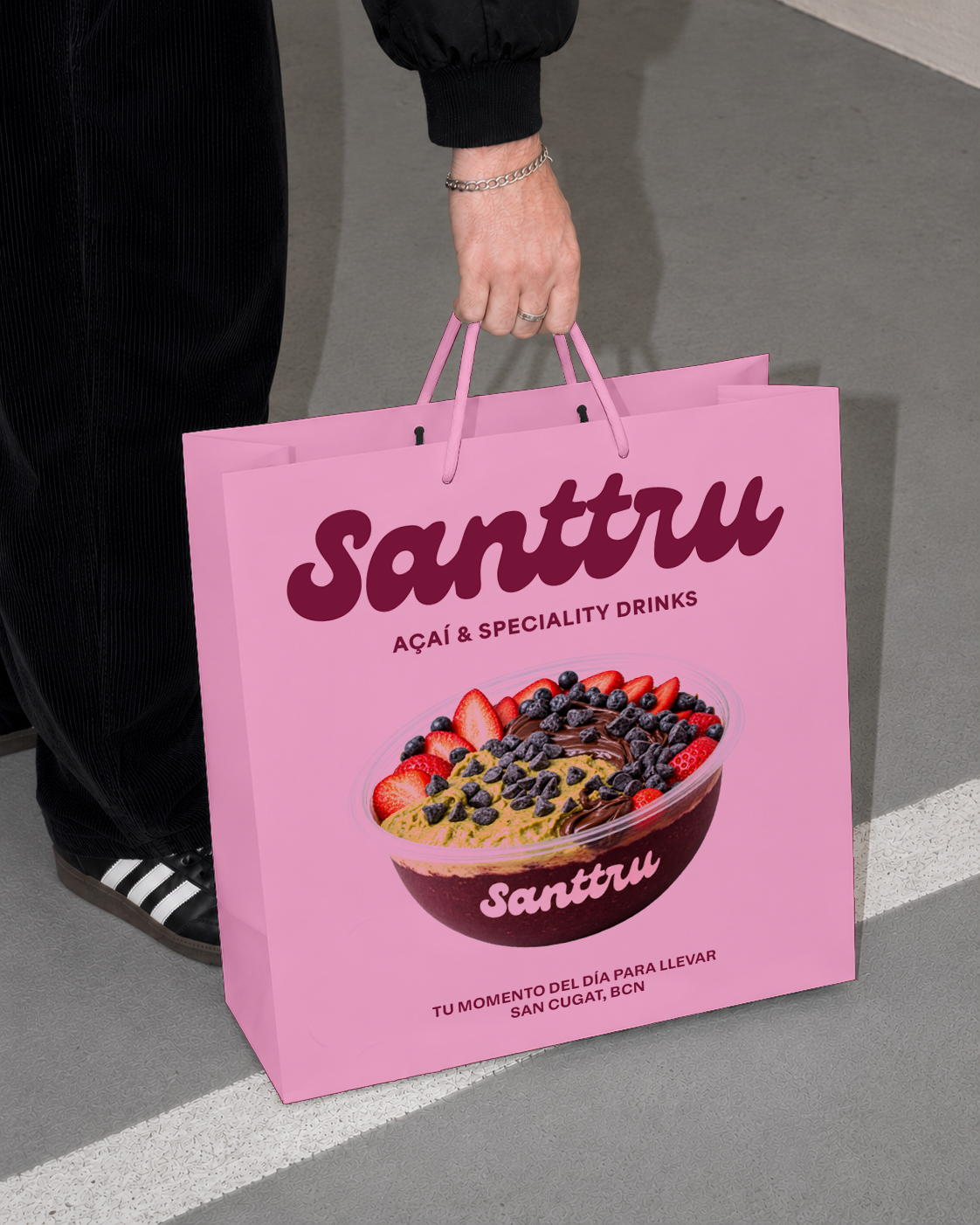
Santtru is an açaí and specialty drinks brand founded in Sant Cugat, bringing wellness into everyday life. Offering açaí bowls, matcha, coffee, and smoothies, the brand combines quality products with a convenient, accessible experience designed for the pace of city life. Inspired by Barcelona’s lifestyle, where sports, creativity, and social life meet, Santtru goes beyond the product to build a community around staying active, feeling good, and enjoying life.
CLIENT
DISCIPLINE
YEAR
STRATEGY & BRANDING
SANTTRU
2026
CHALLENGE
Evolve a local brand perceived as retro and purely healthy into an urban, effortlessly cool identity with a Gen Z aesthetic.
Prepare the brand for growth
Build cohesion and brand recognition
Connect with contemporary culture
CONTEXT
+40
Açaí and speciality drinks stores, primarily driven by franchise brands.
Local stores focused on açaí and speciality drinks.
5
Growing specialty coffee consumption among younger audiences.
83%
Consumers are already willing to pay more for a quality product.
43%
POSITIONING
FITNESS
URBAN CULTURE,
REFINED AESTHETICS AND
OPERATIONAL EFFICIENCY.
MASS-MARKET
FRANCHISES
HOW WE MAKE IT HAPPEN
We don’t want to speak to young people. We want to speak like them. Understand their language and codes to connect naturally, without forcing the conversation or trying to act young.
Young people
We don’t want to talk to young people. We want to speak their language. Understand their codes and connect naturally, without forcing the conversation or trying too hard to fit in.
Trendy
We don’t want to speak to young people. We want to speak their language. Understand their codes and connect naturally, without forcing the conversation or trying too hard to seem young.
Creatives

Socially engaged
We don’t want to talk to young people. We want to speak their language. Understand their codes and connect naturally, without forcing the conversation or trying too hard to fit in.
KEY VISUAL DIFFERENTIATORS
A brand that's instantly recognisable.
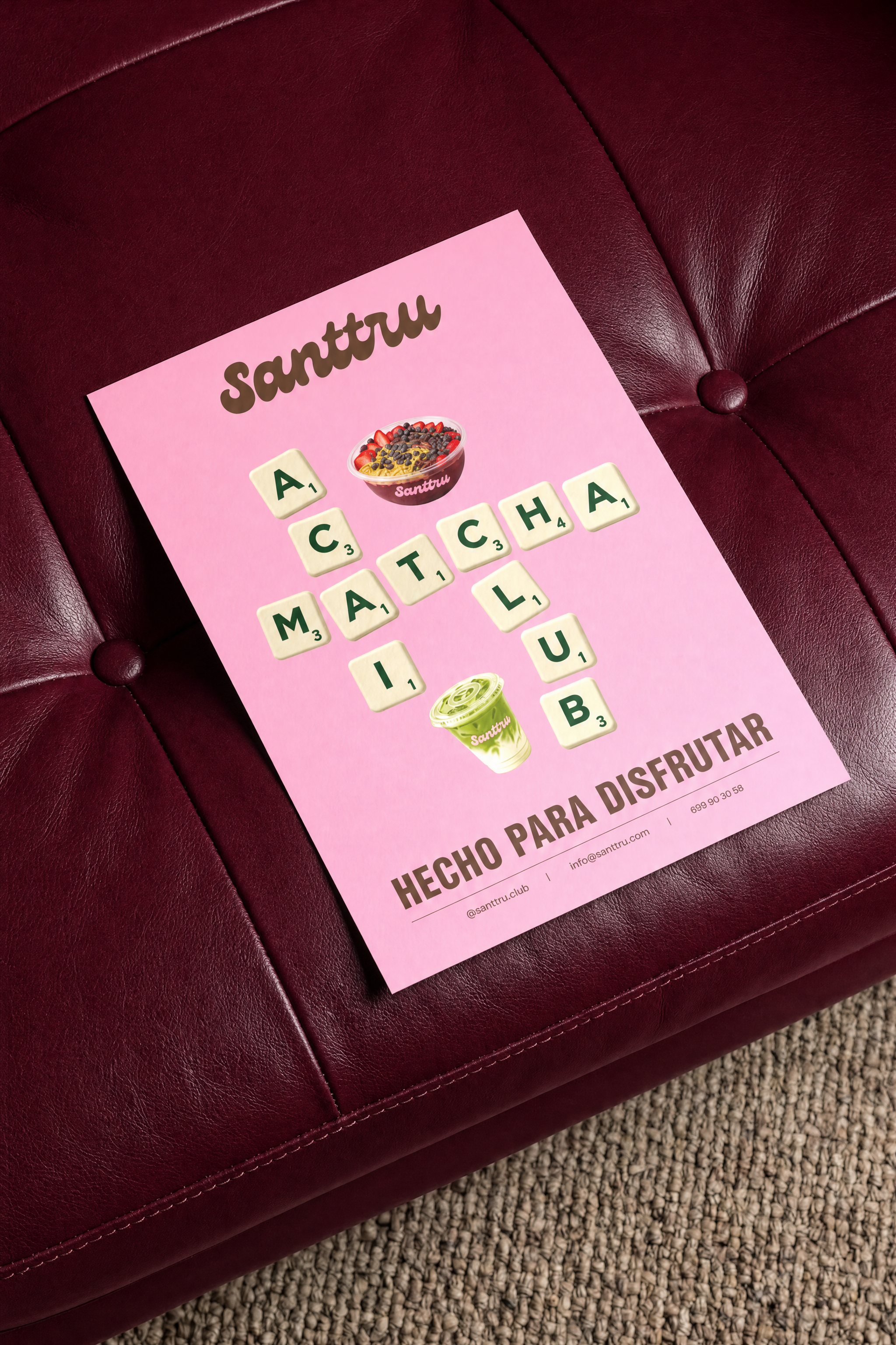
Distinctive visual codes that make Santtru recognisable even before seeing its name.
Build anticipation
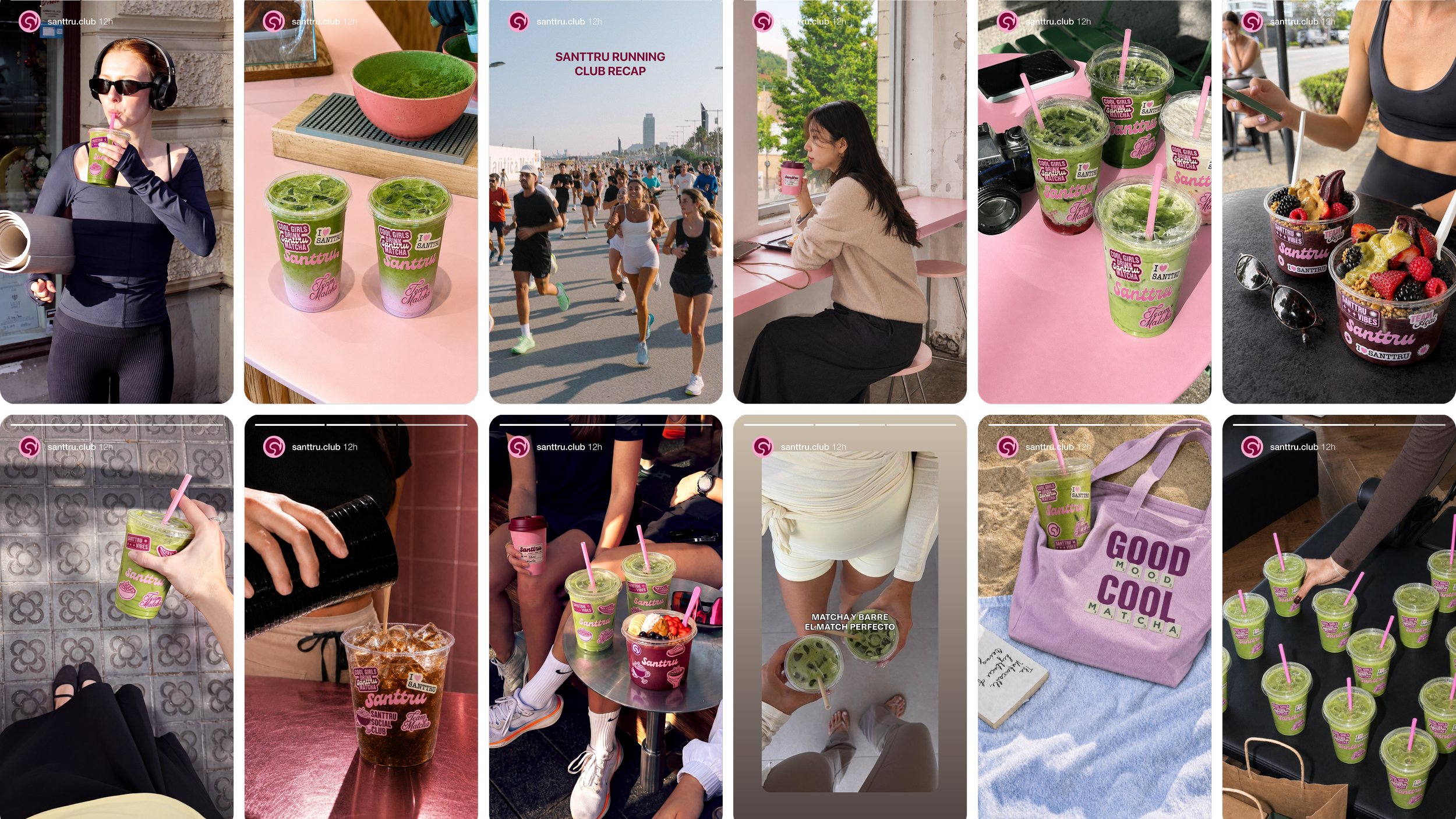
Social media content that positions the brand as a youthful, social hangout, alongside influencer collaborations to build anticipation.
Barcelona as a brand code
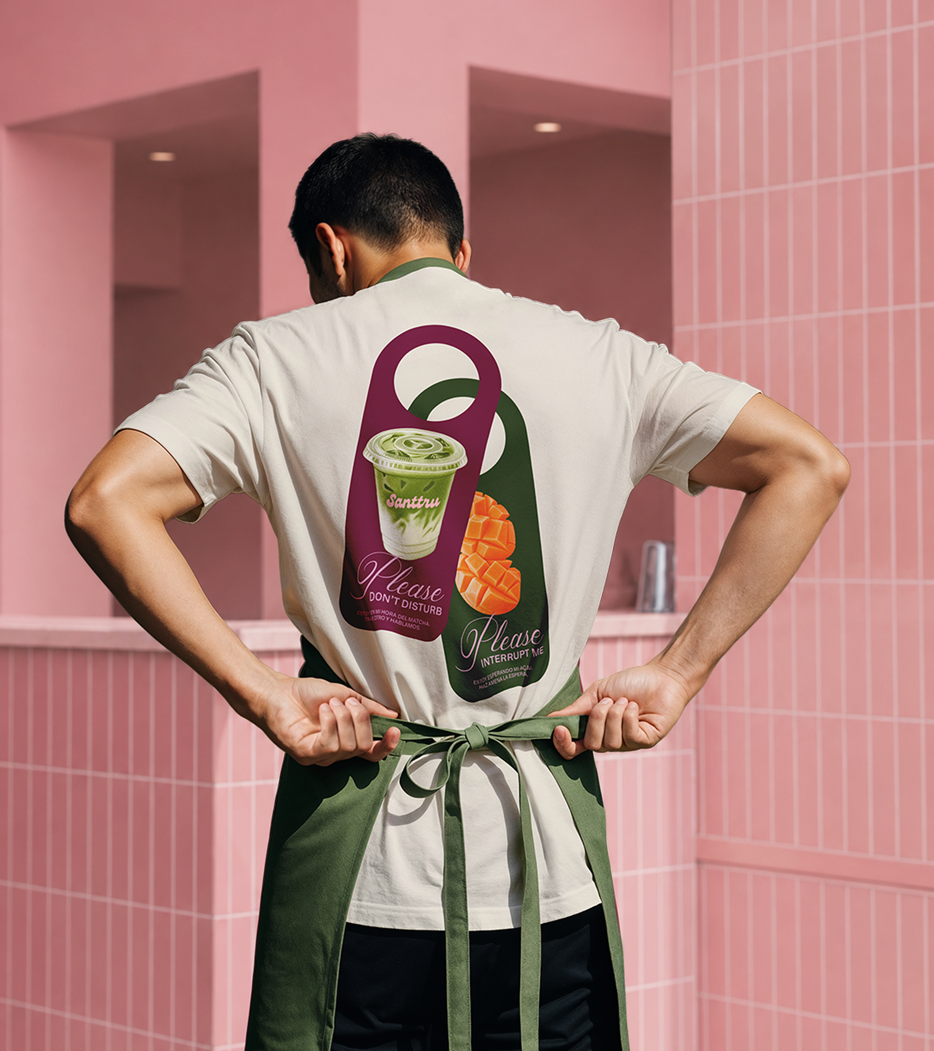
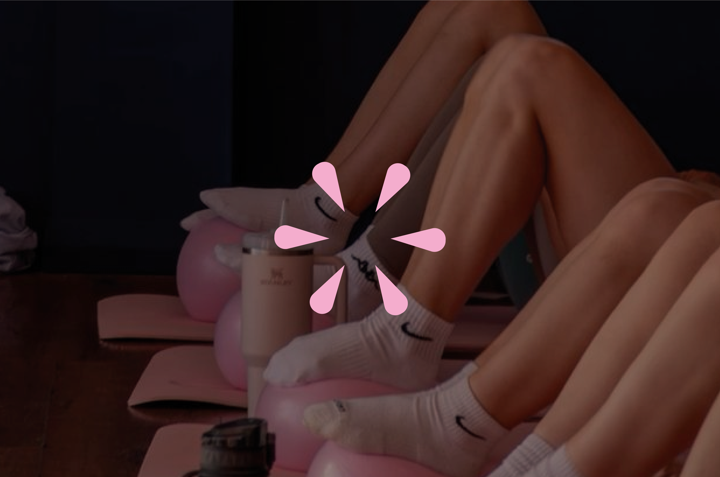
A photographic direction that places Santtru within recognisable Barcelona settings. Communicate through visual codes that resonate with locals.
The Santtru vibe
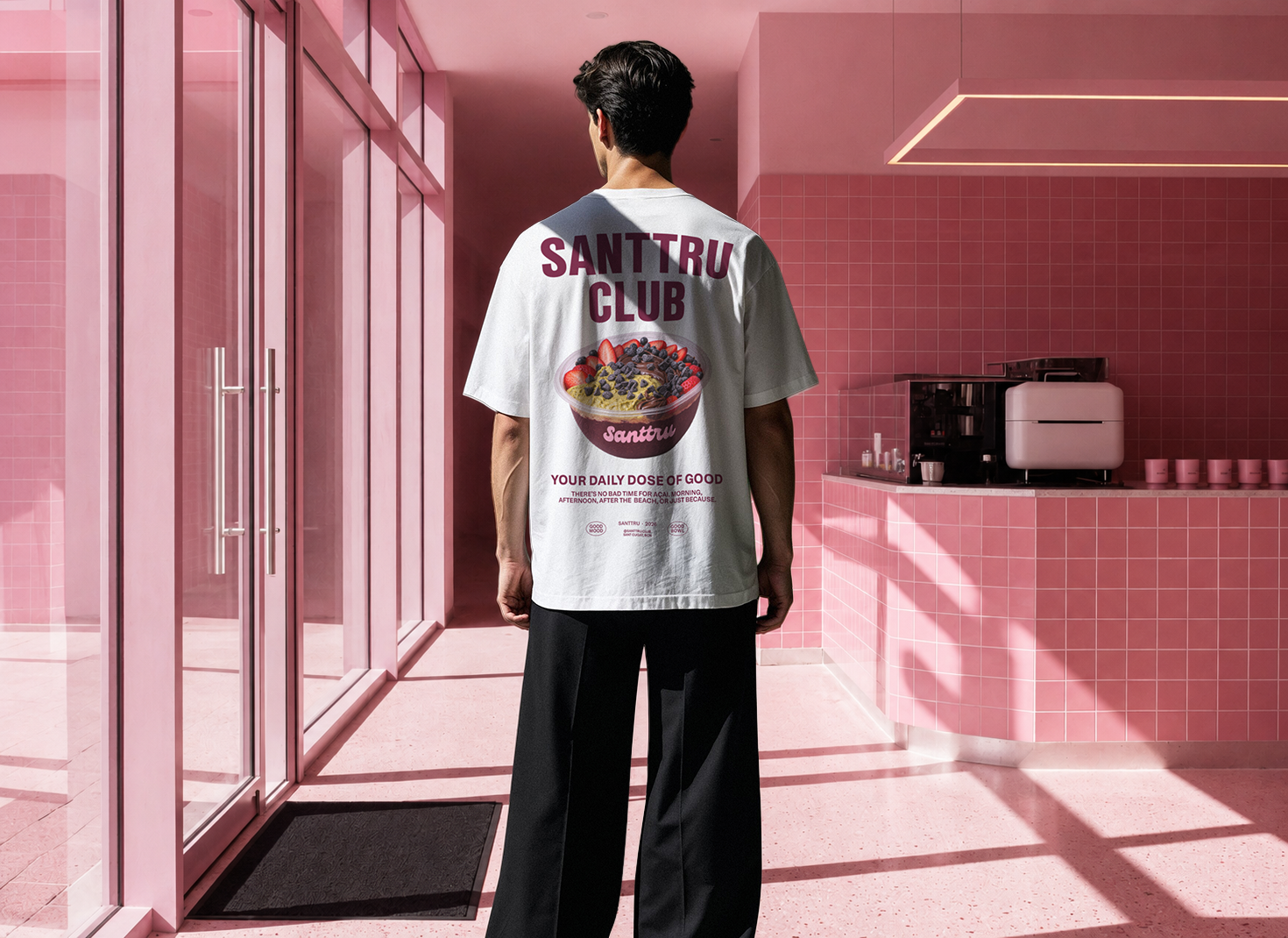
Santtru’s identity is rooted in an urban, Mediterranean energy shaped by Barcelona’s lifestyle, where wellness, culture, fashion and sport naturally coexist.
BEFORE & AFTER

EVOLUTION
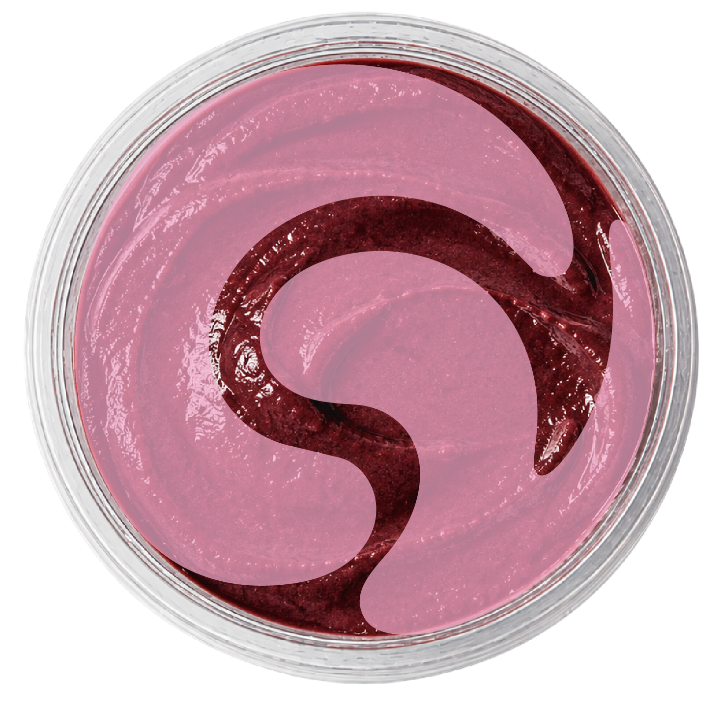
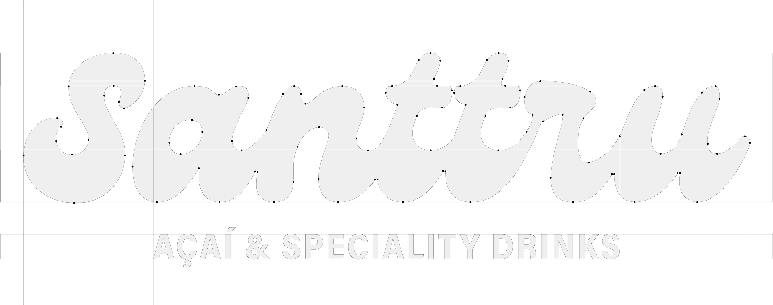
We move from a rigid, star-shaped icon to an organic, fluid and enveloping symbol that integrates seamlessly with Santtru’s logo typography.
This new shape evokes the creamy texture and natural flow of açaí.

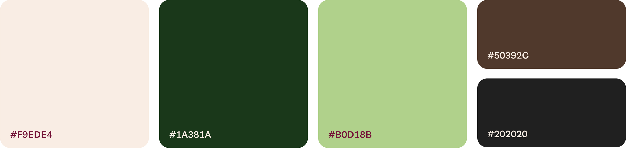
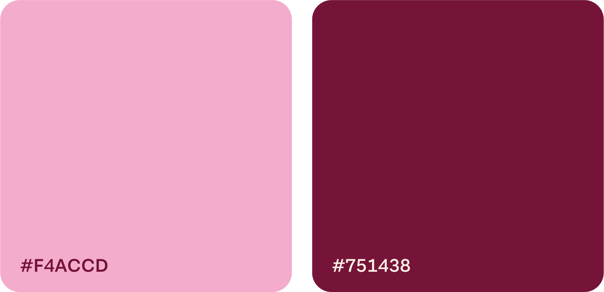
COLOR
PALETTE
BEFORE
→
AFTER
BEFORE
AFTER
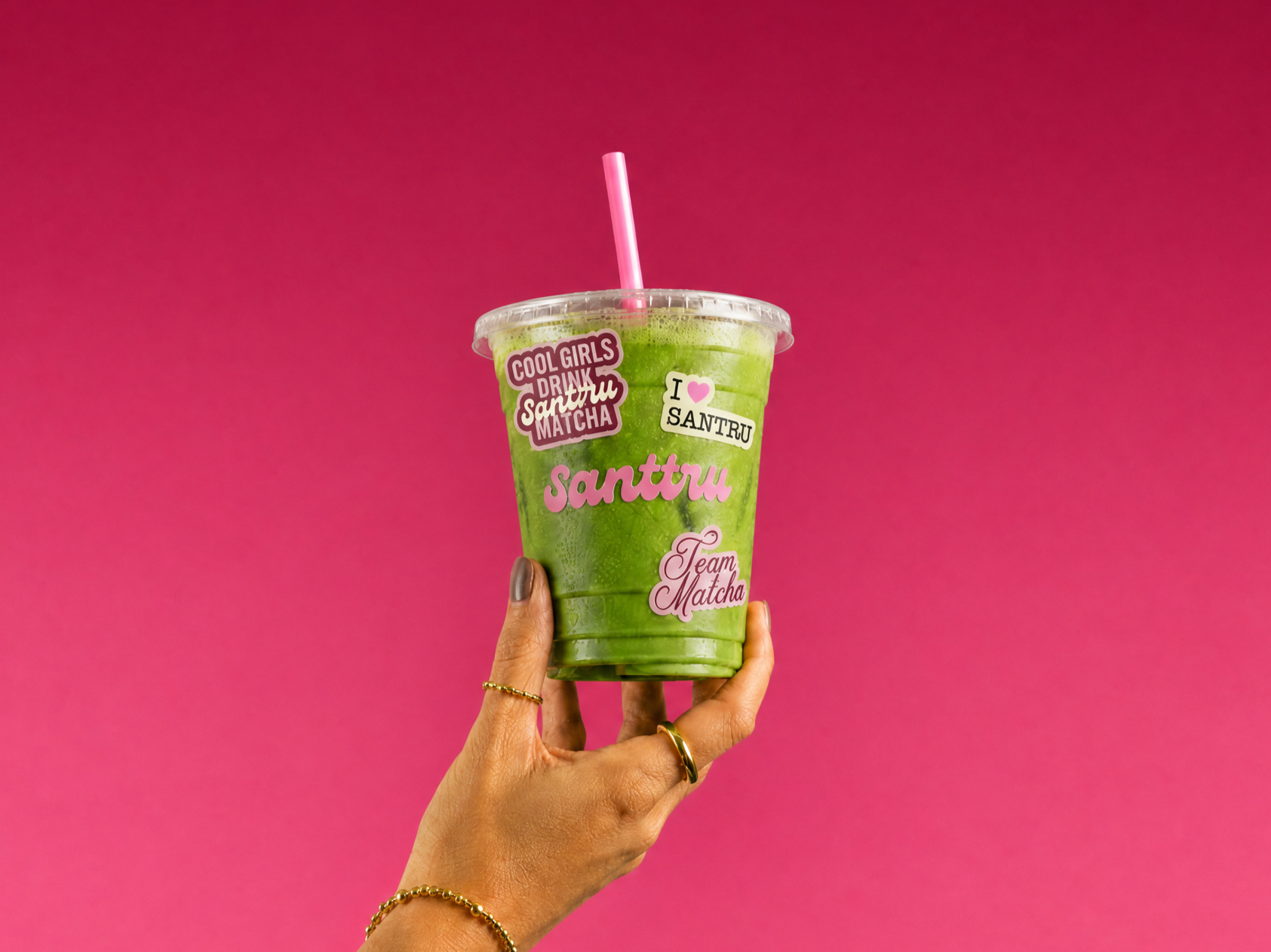
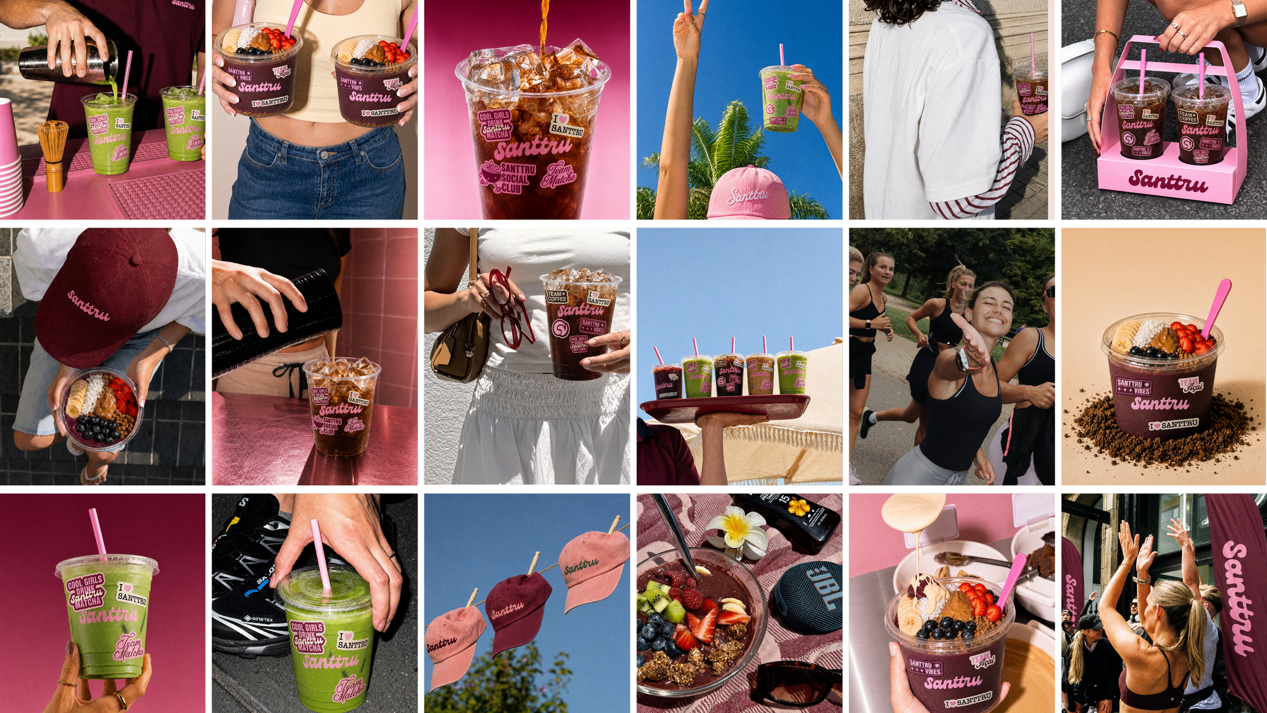
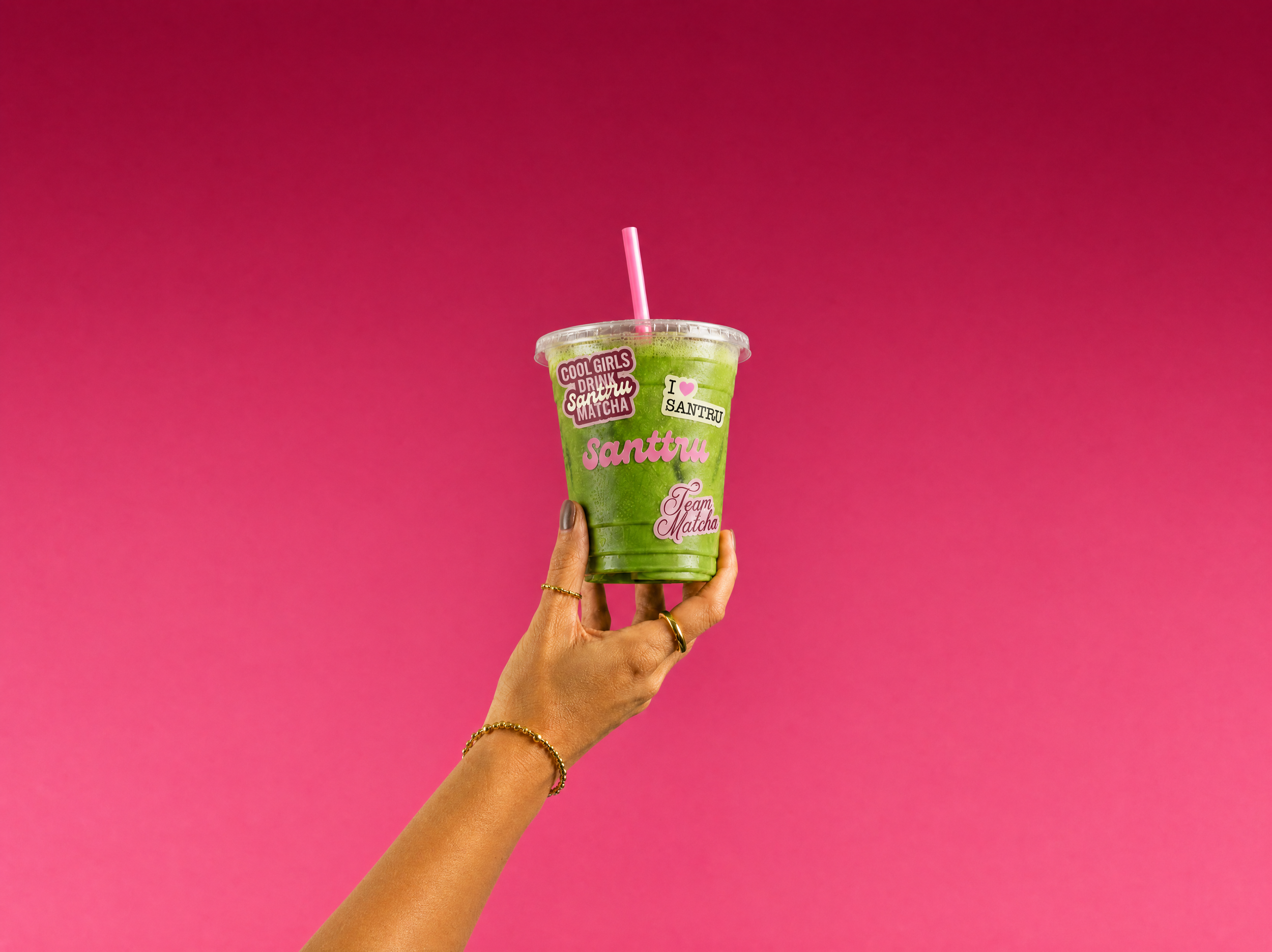
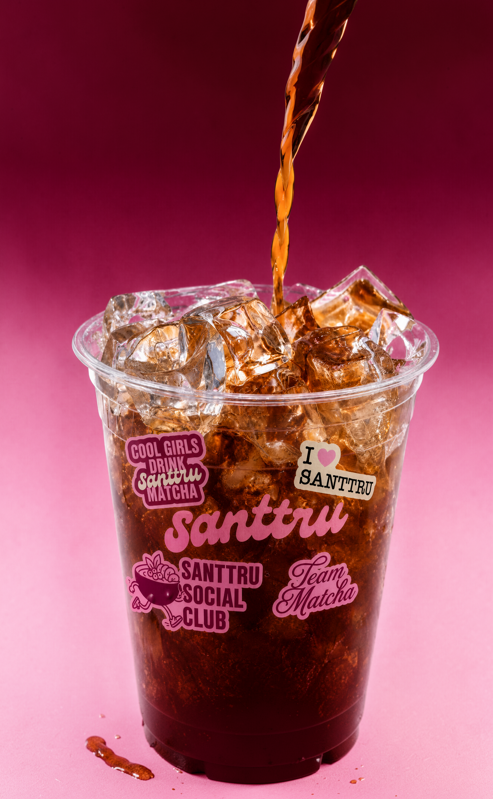
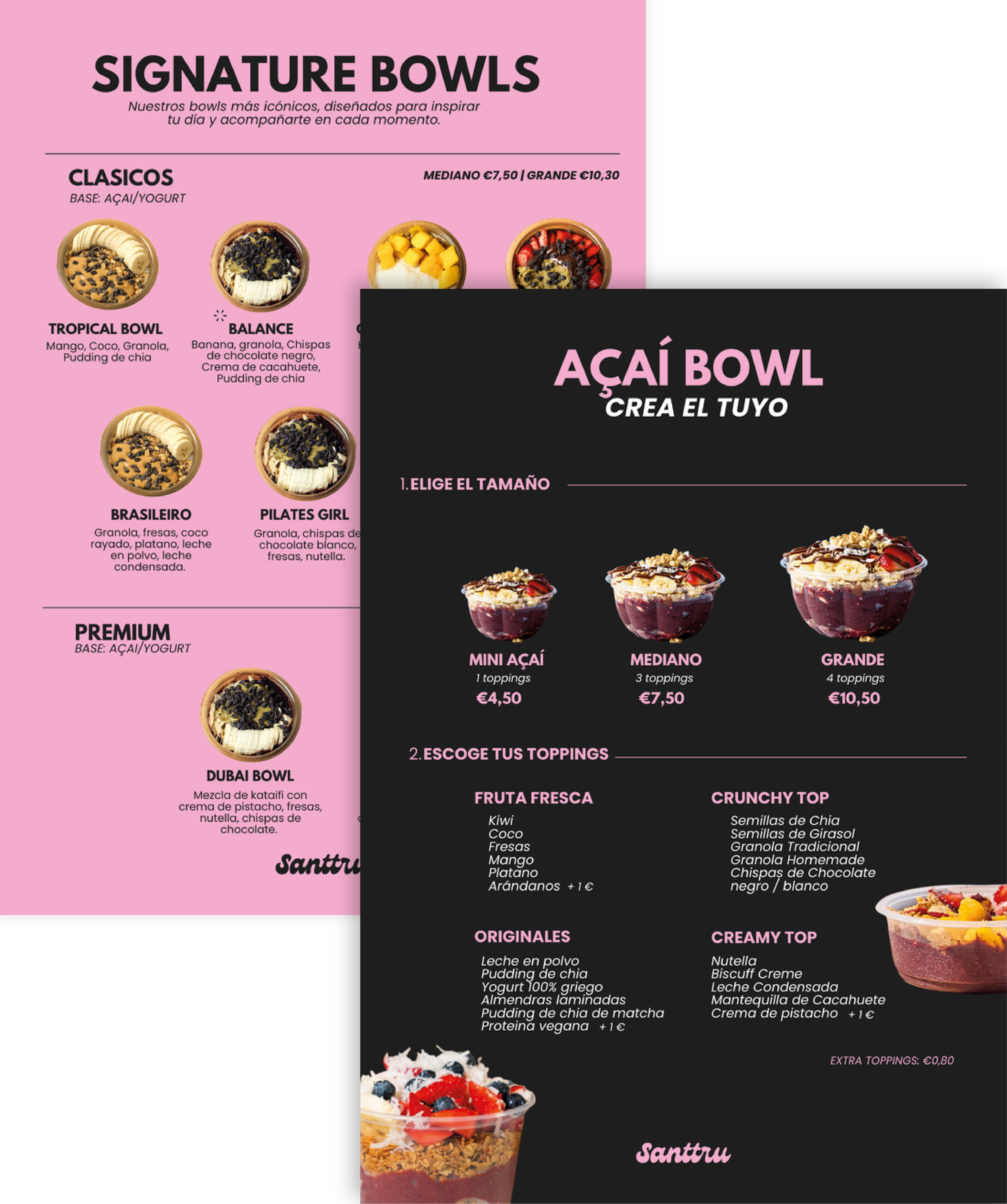
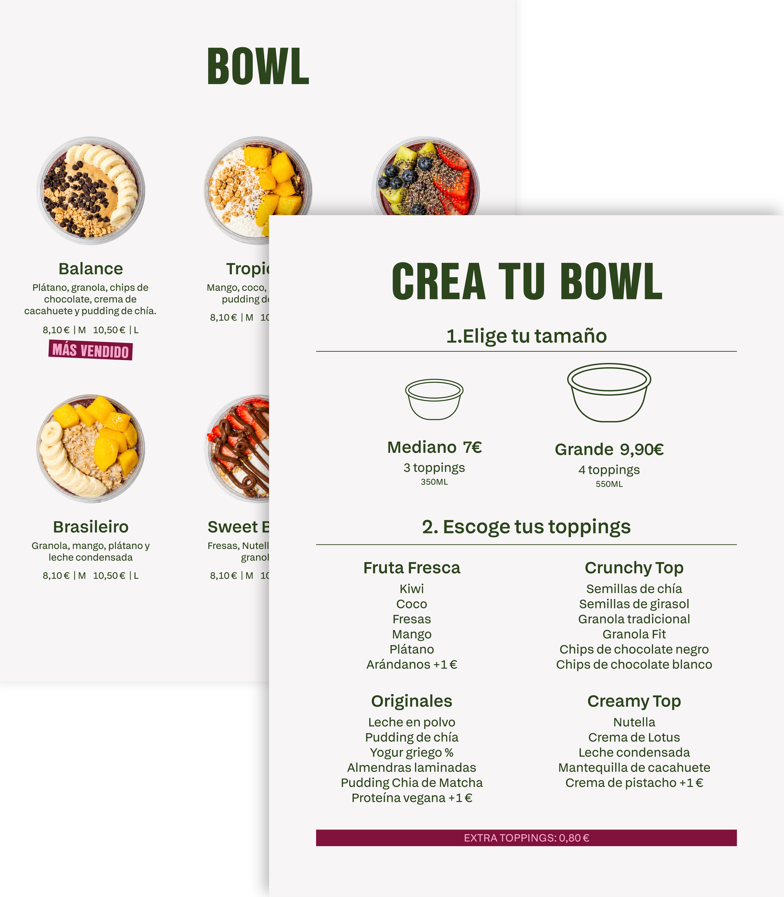
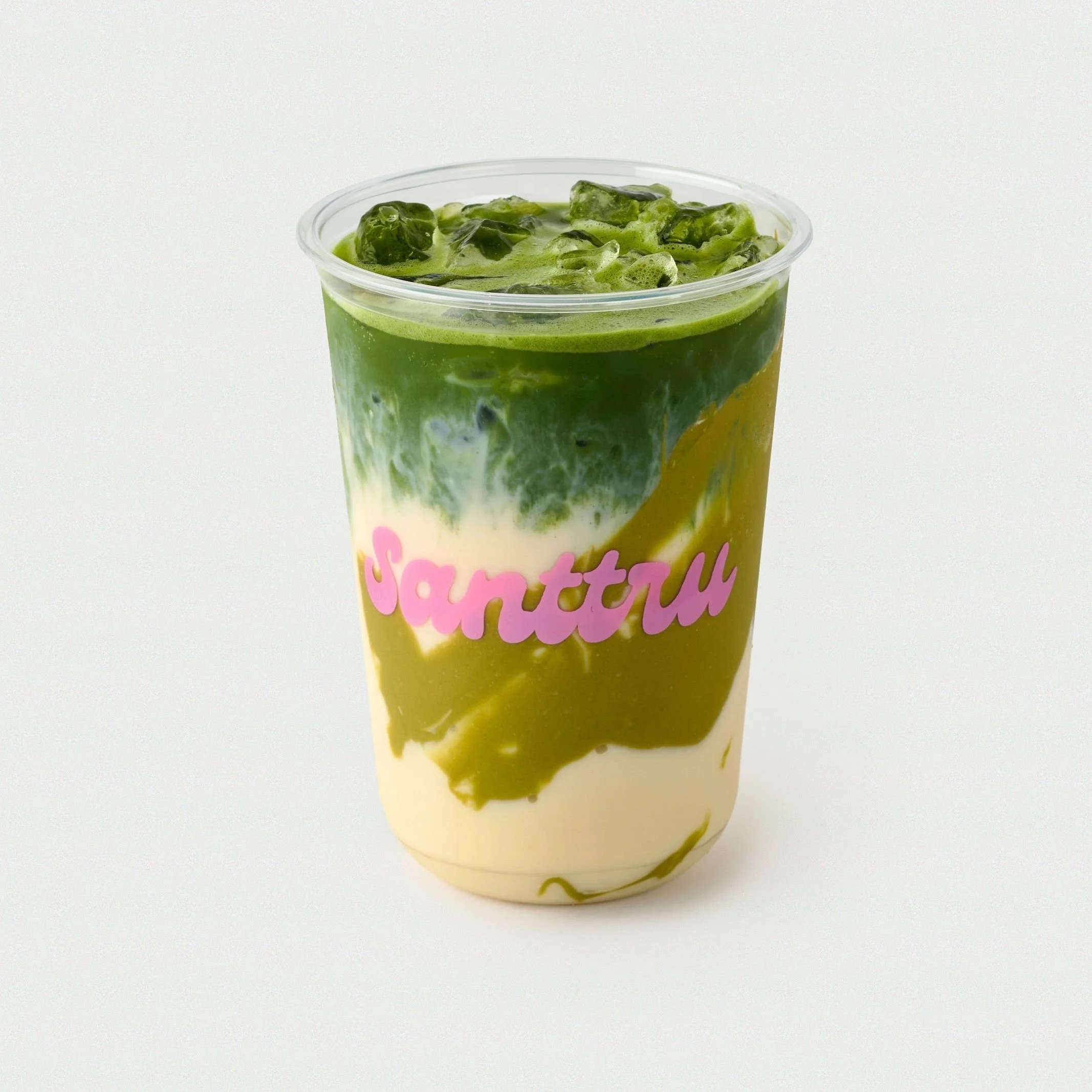
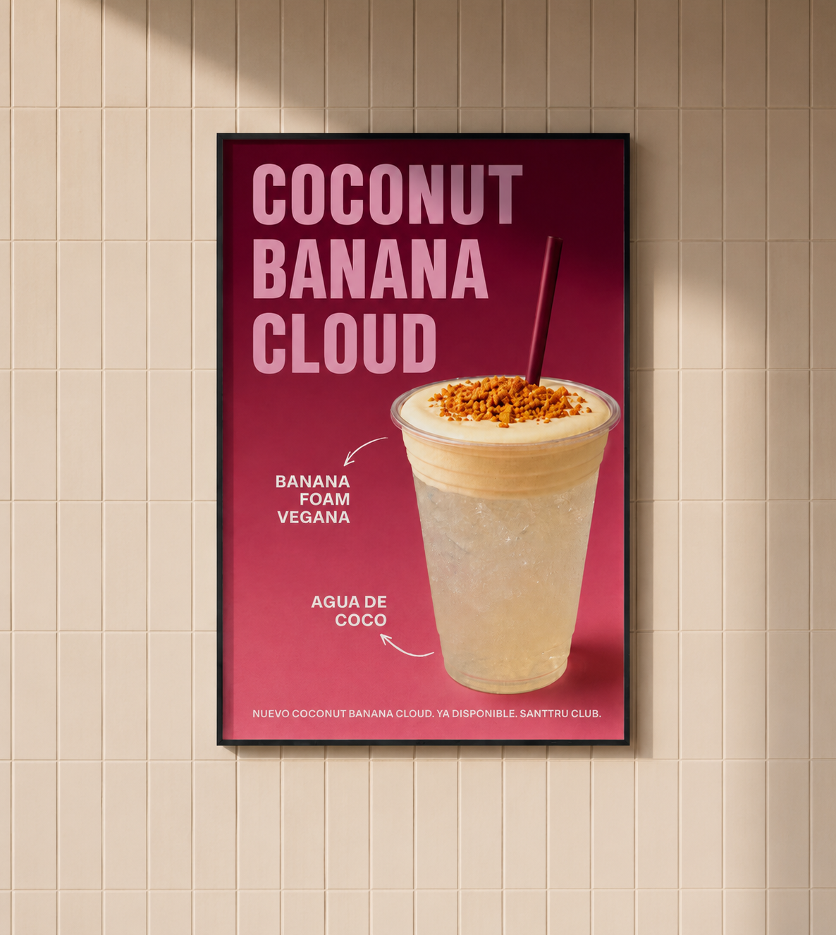
Previously, product photography relied on neutral backgrounds and simple compositions, with packaging limited to the application of the logo. The new visual direction introduces a more expressive photographic style, featuring gradient backgrounds in the brand’s colors to bring personality, dynamism, and stronger brand recognition.
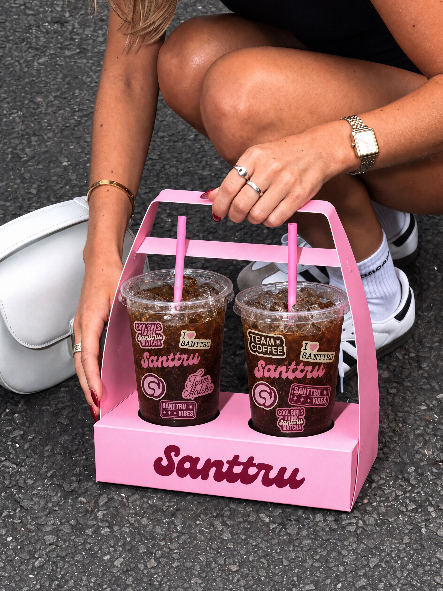
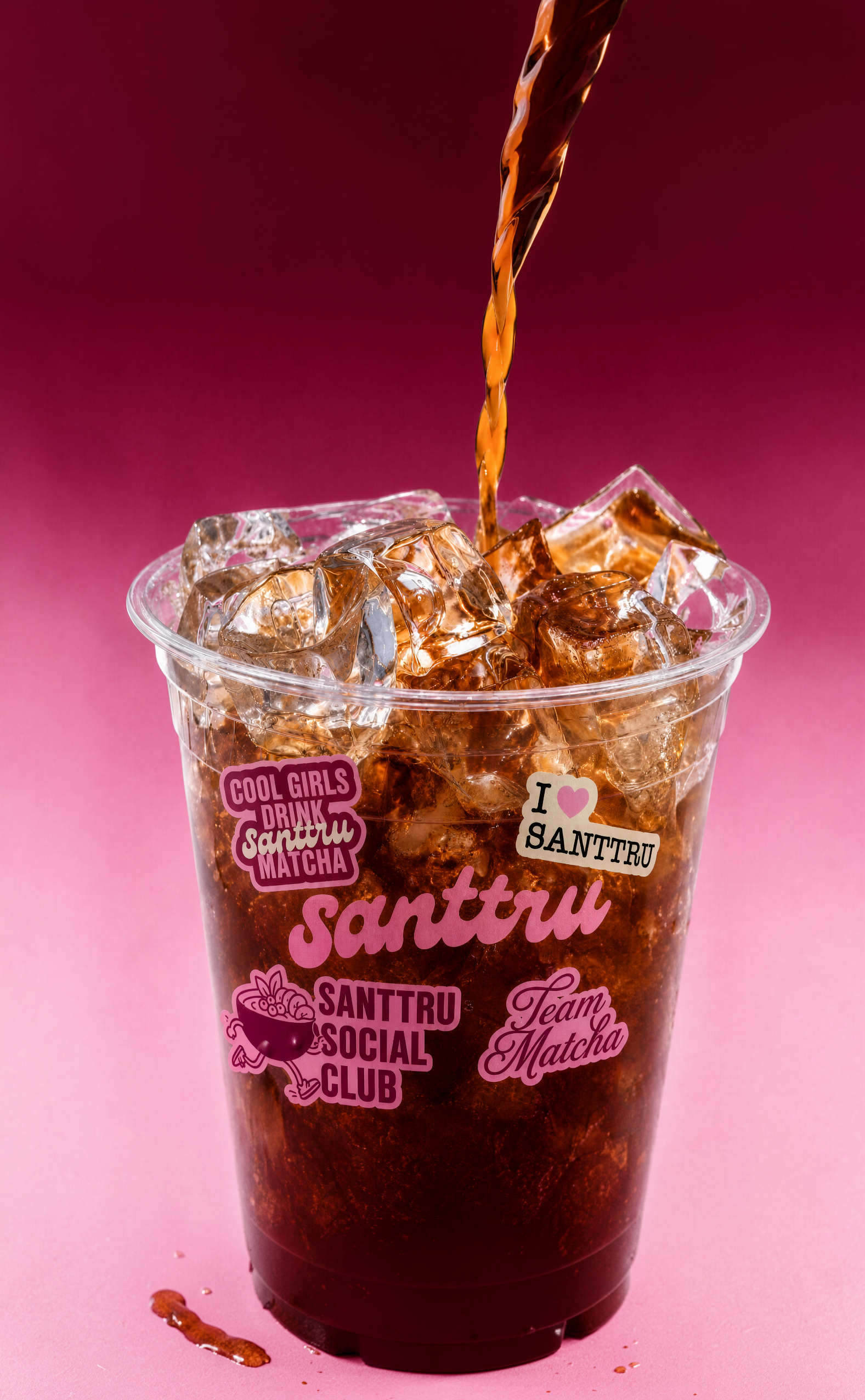
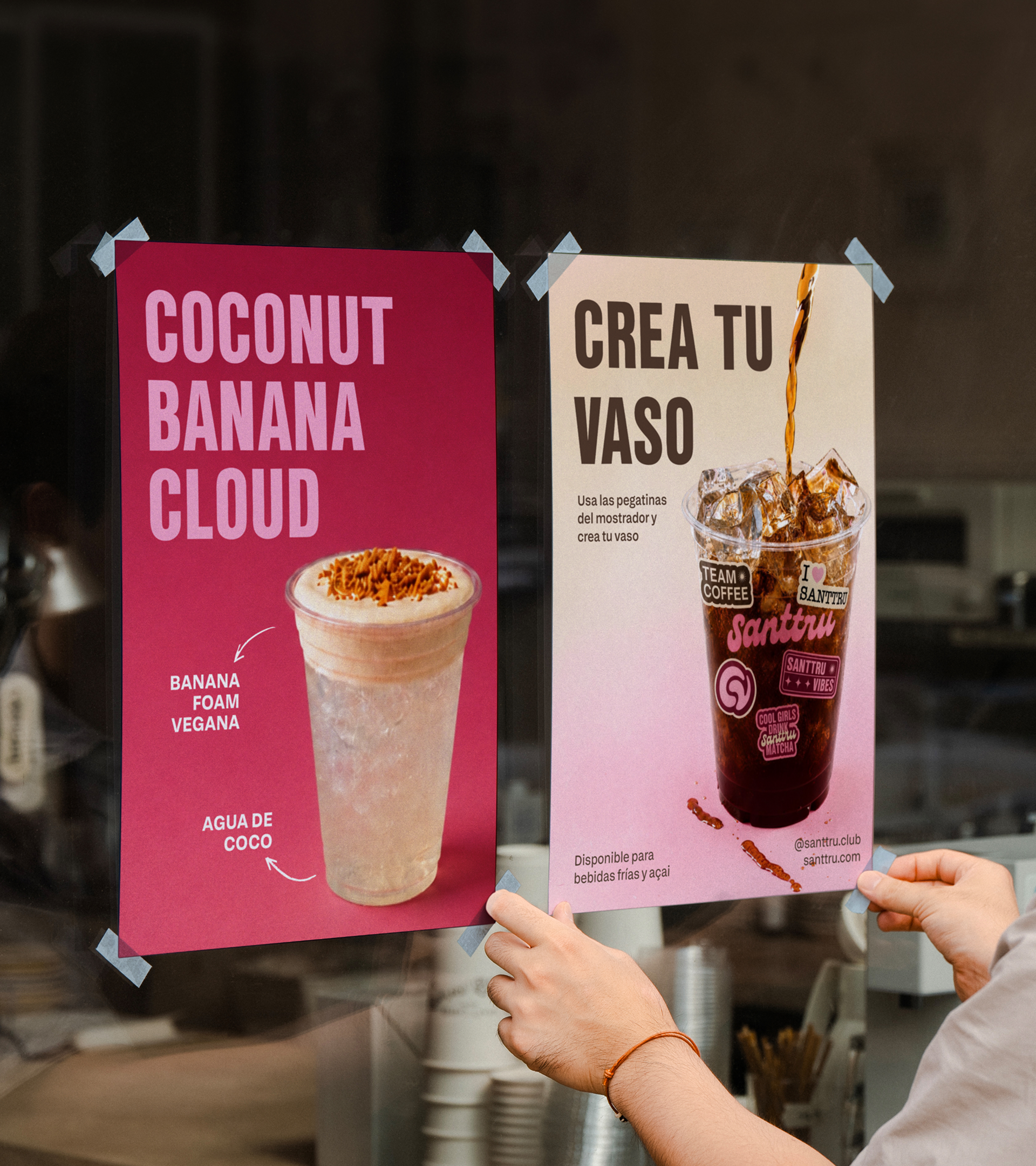
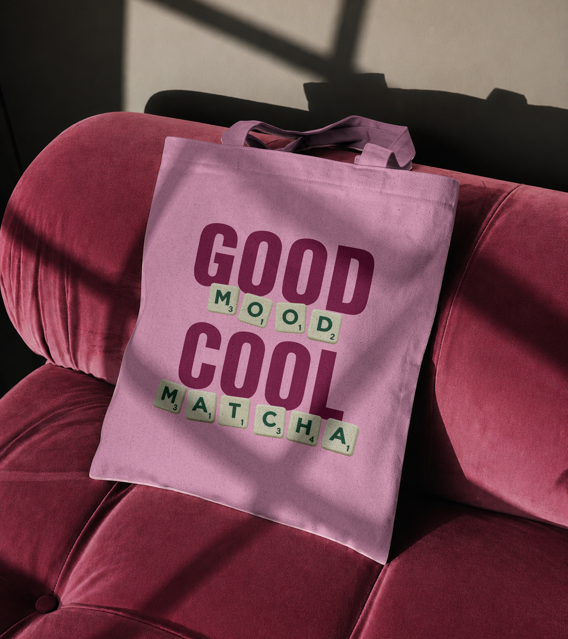
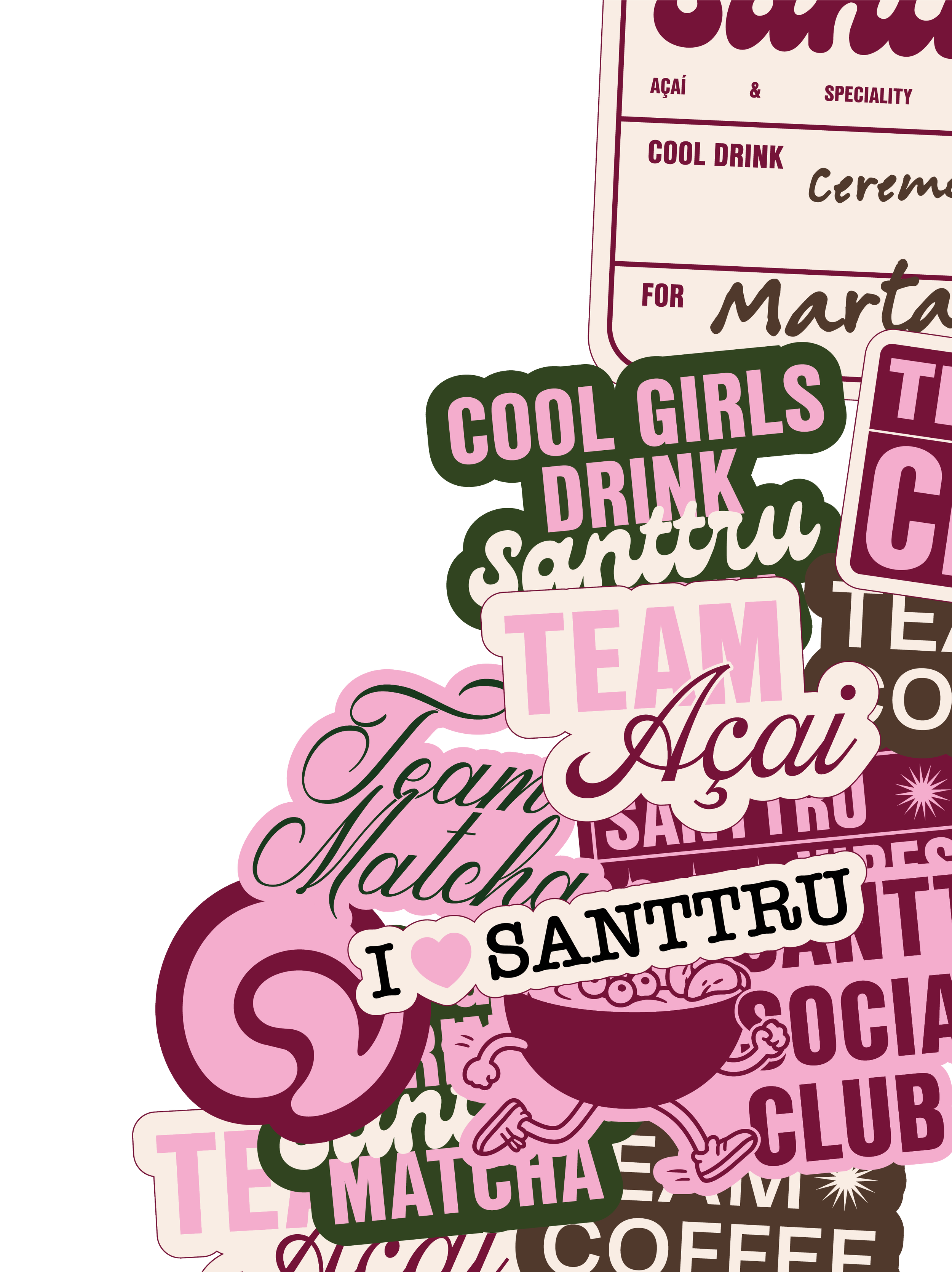
At the same time, the packaging evolves into a more versatile and customizable system, incorporating stickers and graphic elements that allow for seasonal editions, campaign adaptations, and a stronger connection with the community, while maintaining a consistent brand identity.
PACKAGING & STICKERS
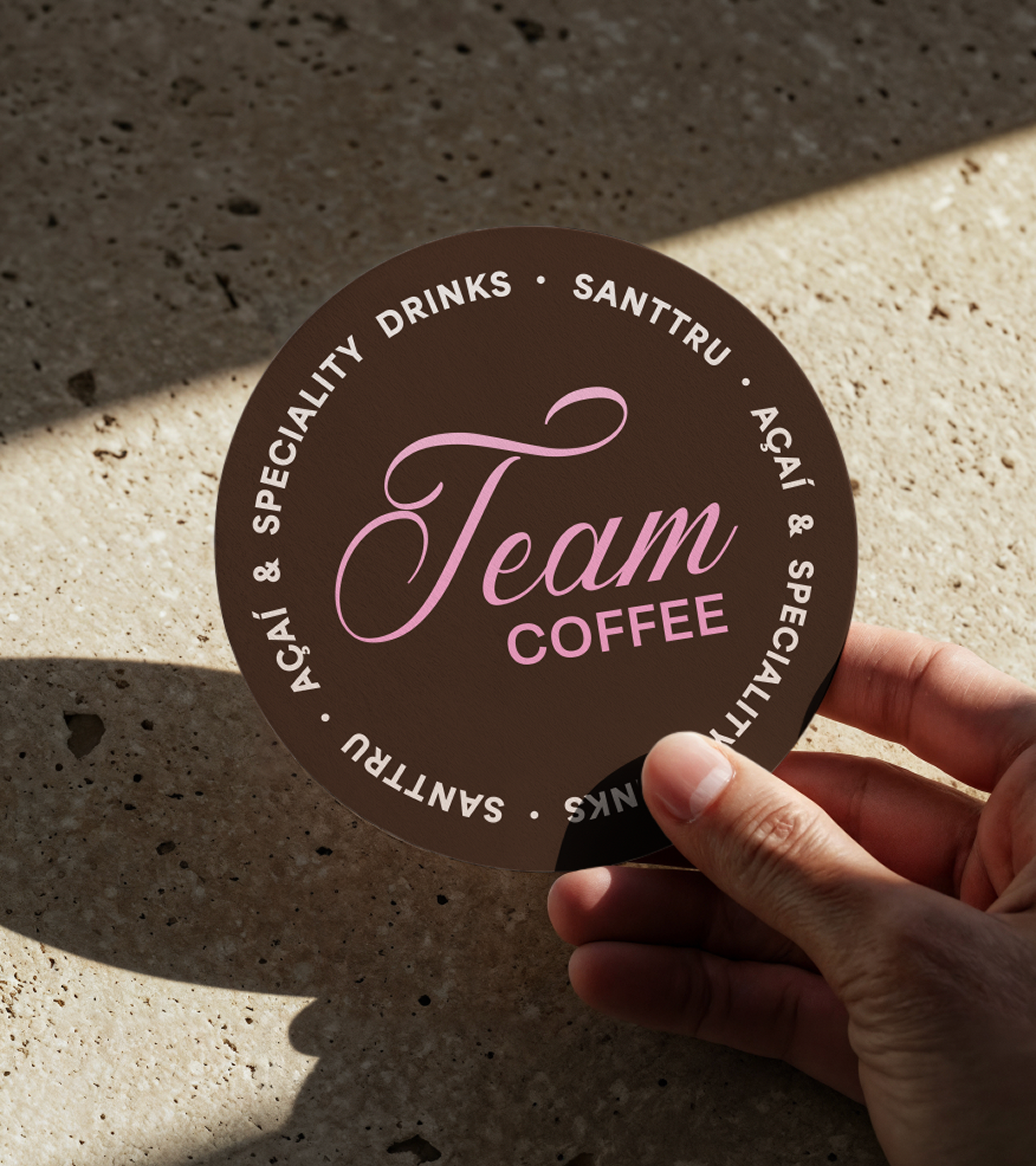
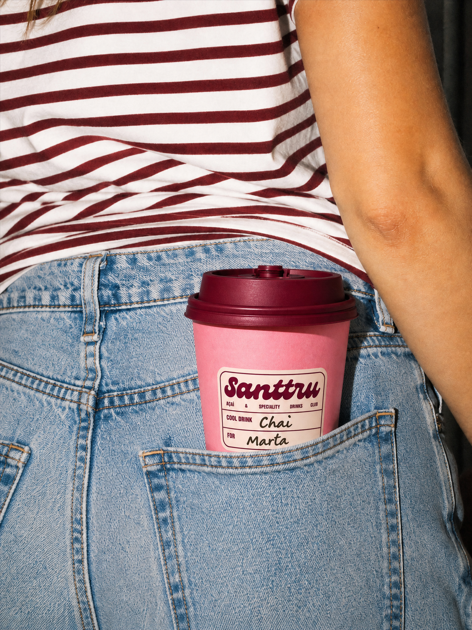
The logo and colour palette were the main elements featured across the packaging.
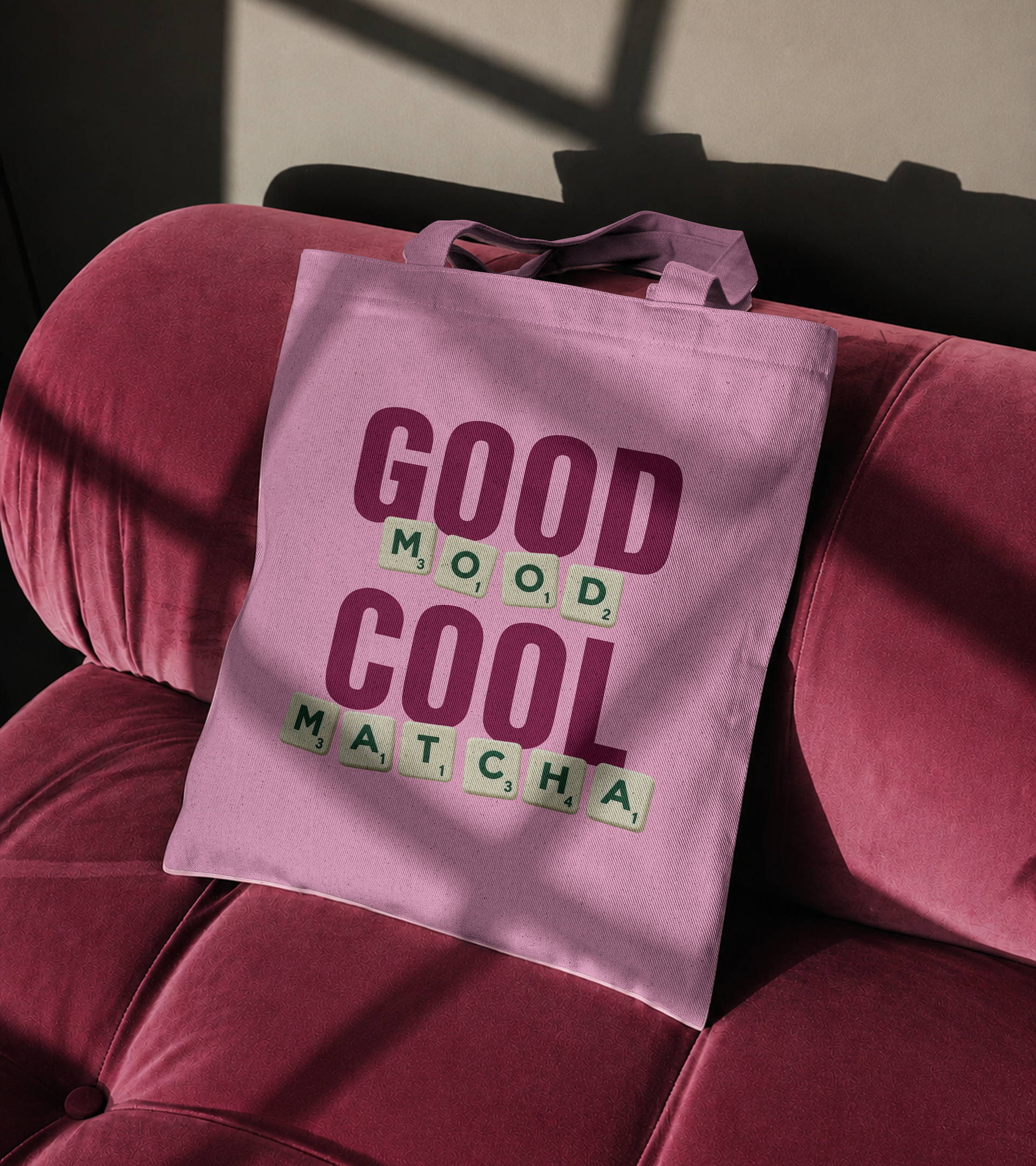
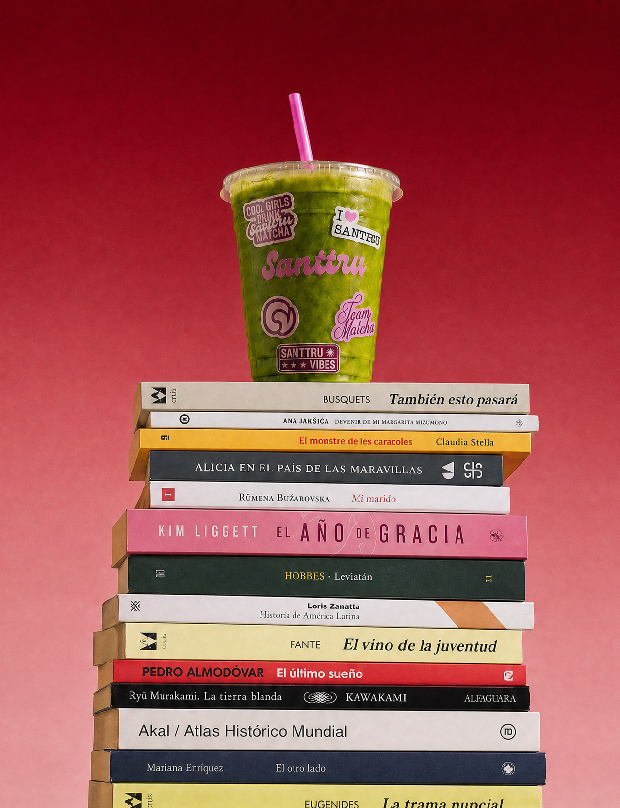
Stickers become one of Santtru’s most distinctive packaging assets. Their role is to bring variety and personality to each application, allowing the packaging to evolve over time and across seasons without losing brand recognition.
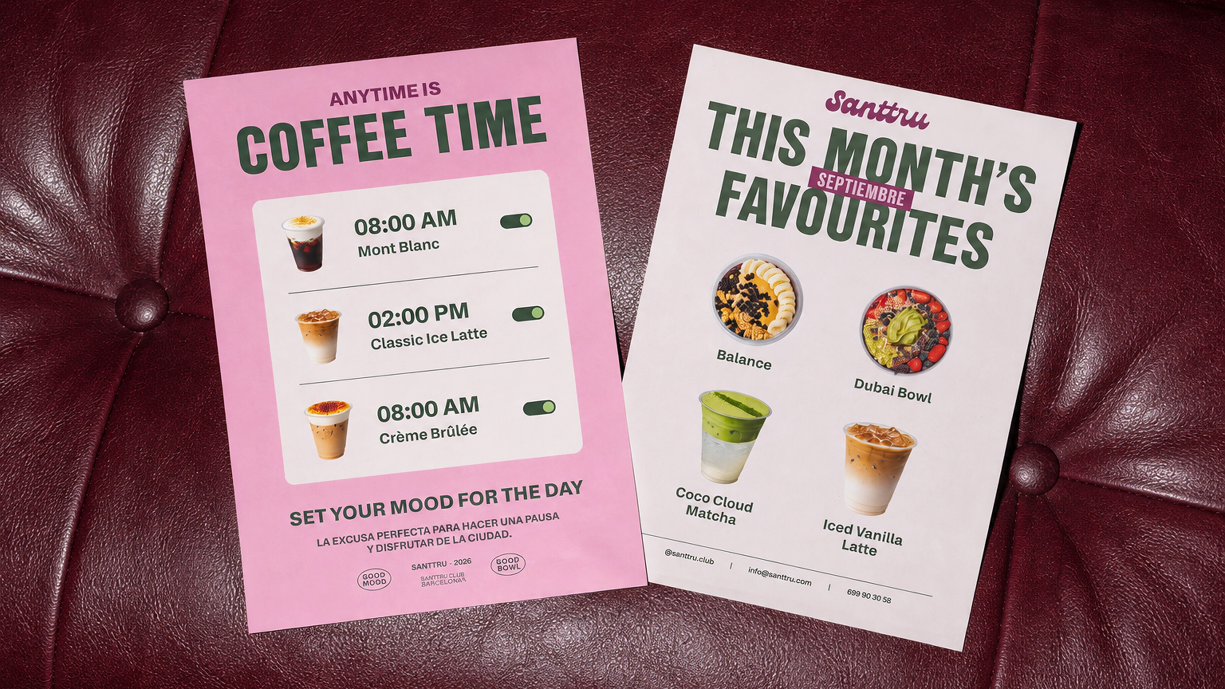
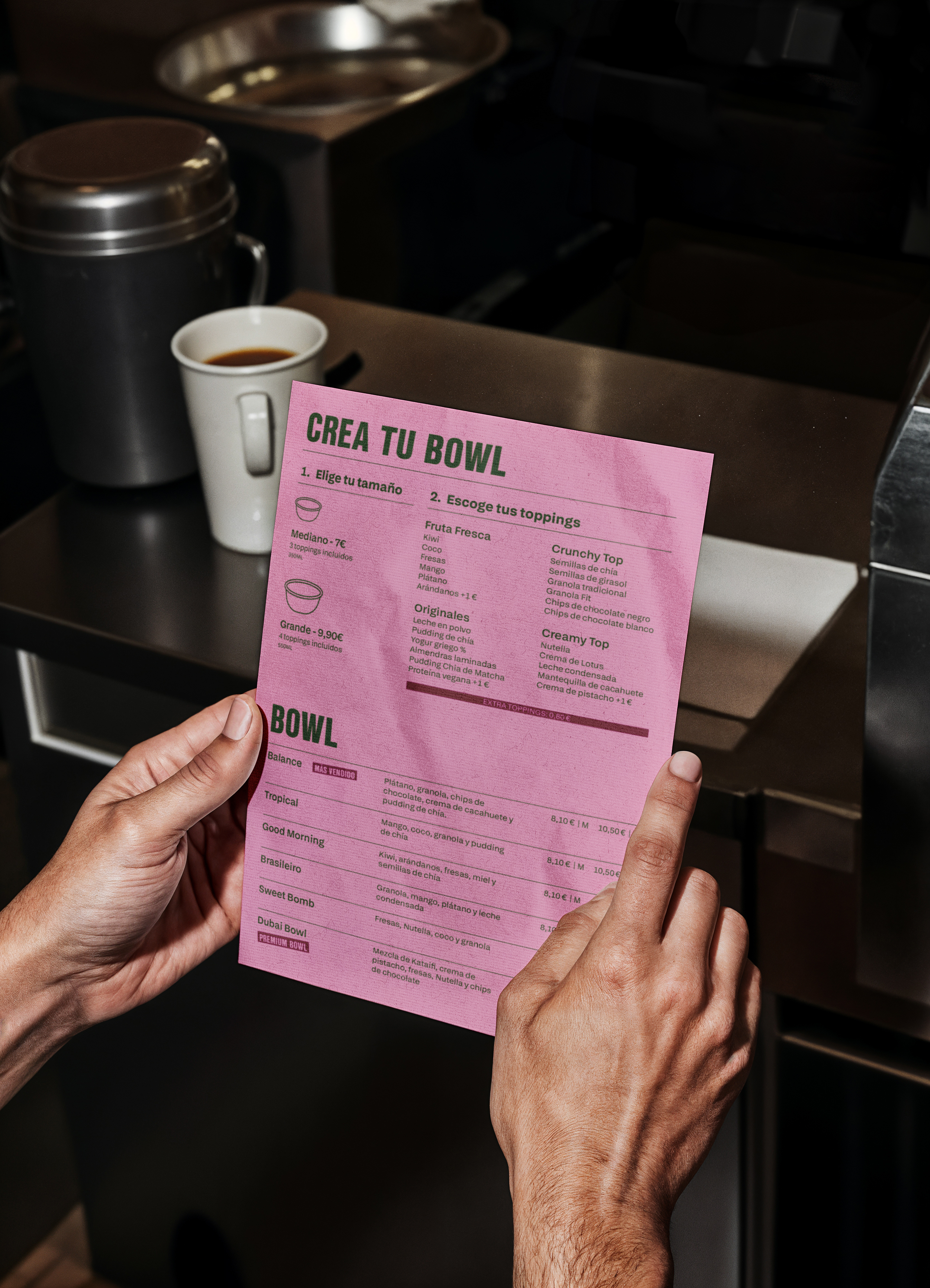
CAMPAIGNS & CREATIVE ASSETS
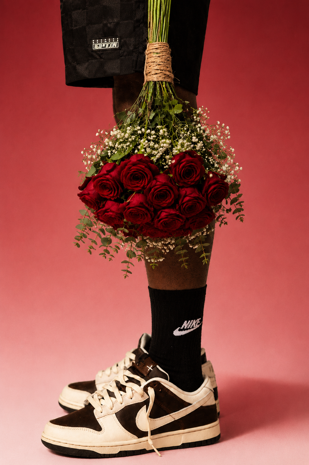
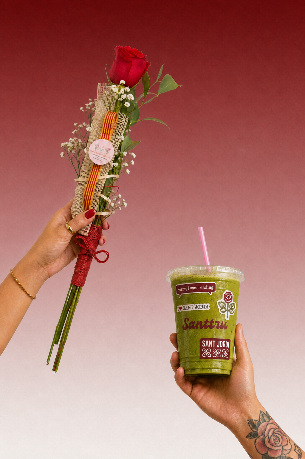
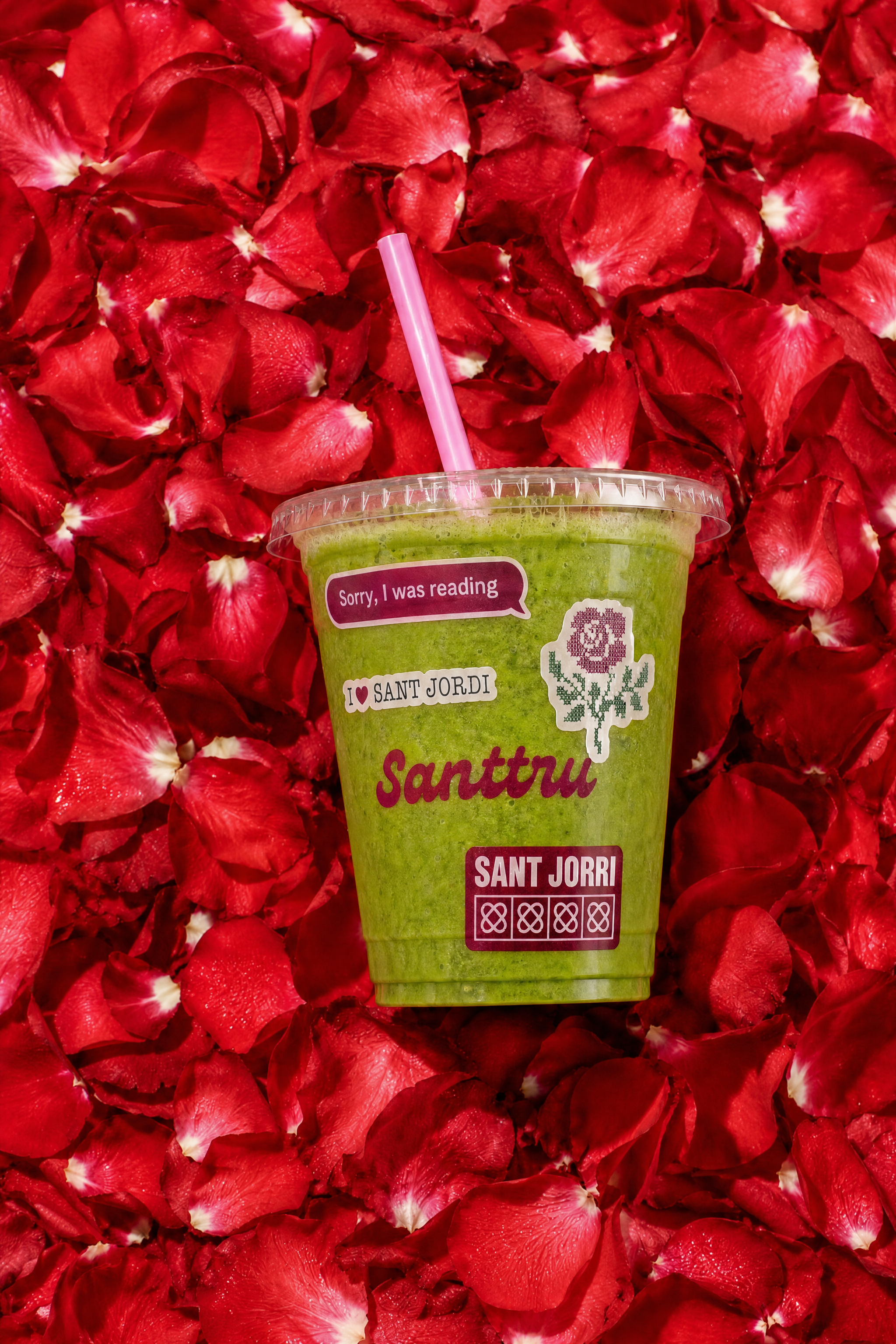
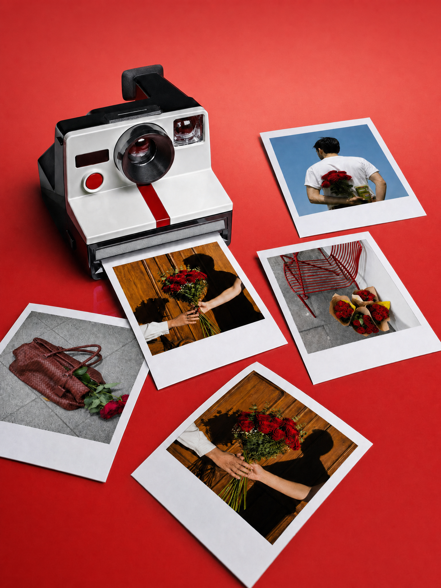
A Sant Jordi campaign has been developed, featuring themed stickers to personalise the packaging.
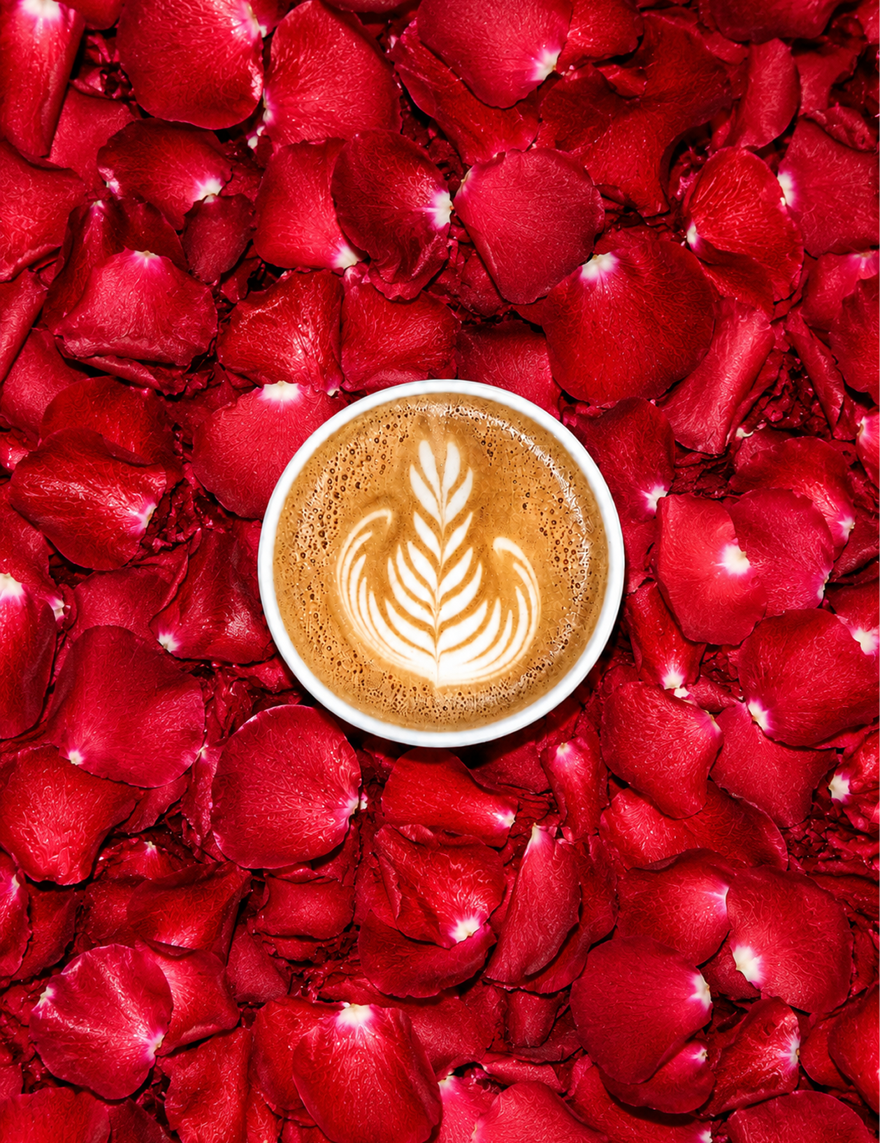
It is supported by a versatile yet cohesive photographic direction, combining studio photography with outdoor imagery that captures real-life moments, while staying true to the brand’s community-driven spirit and dynamic energy.
LAUNCHES
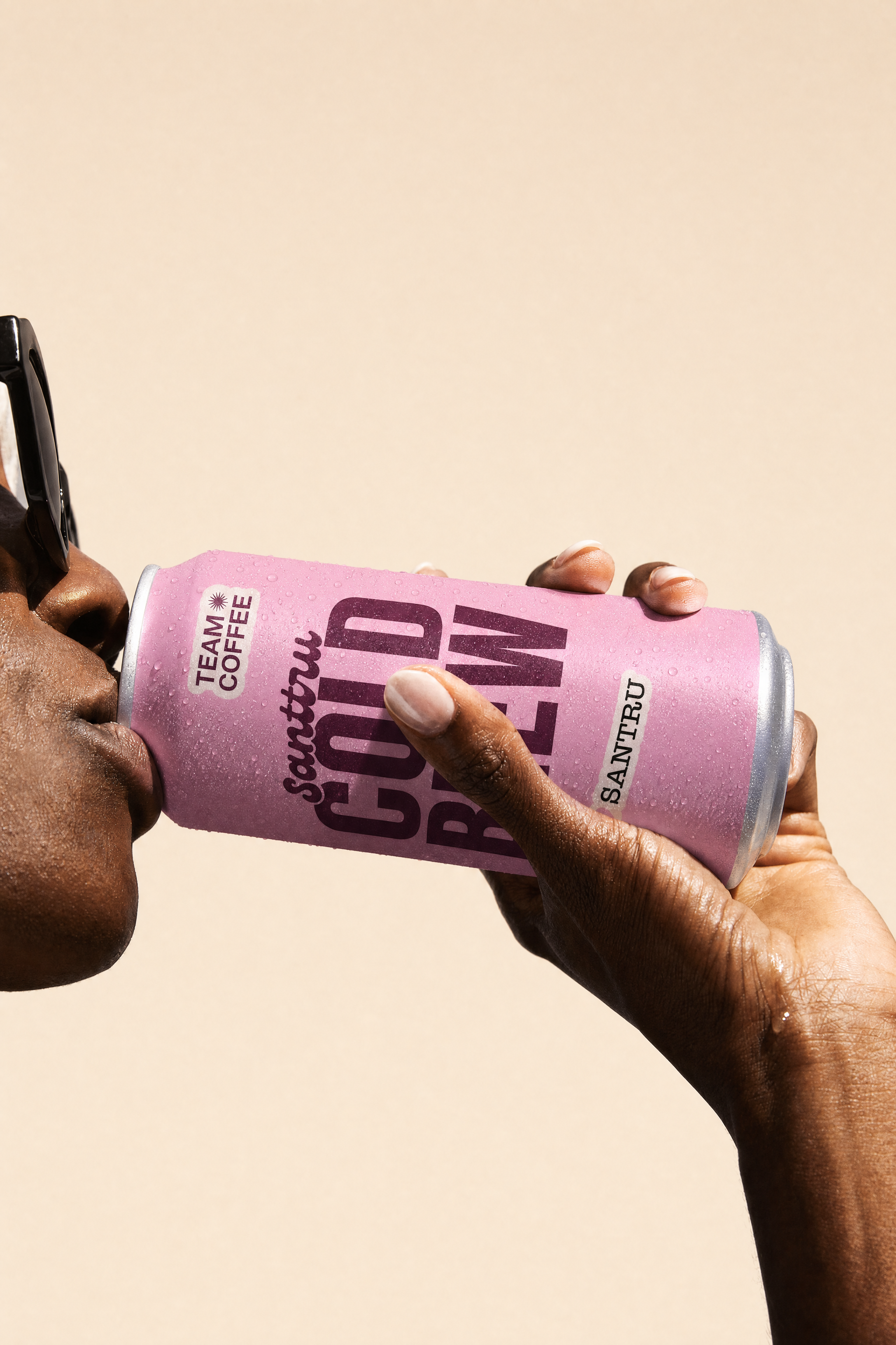
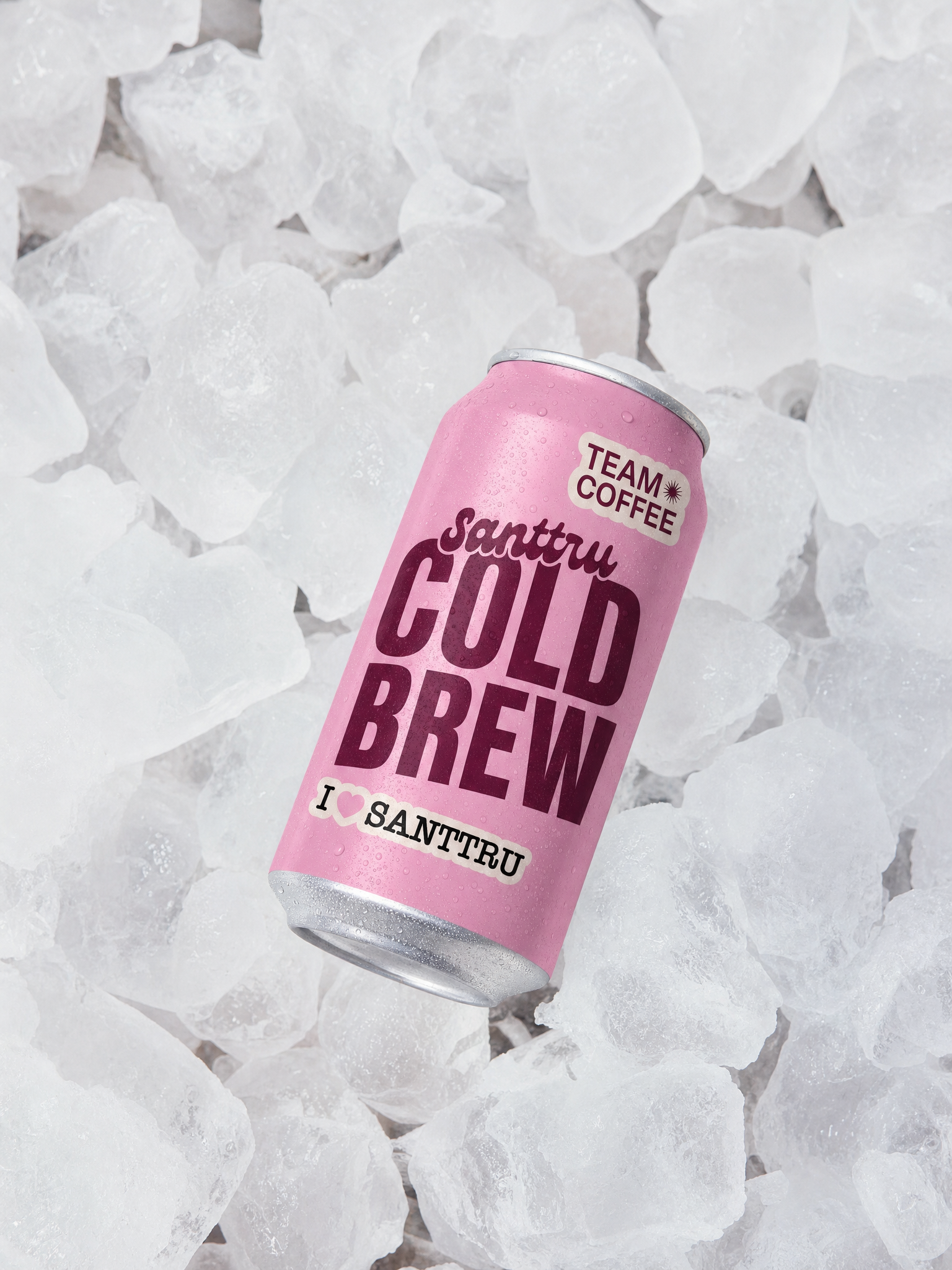
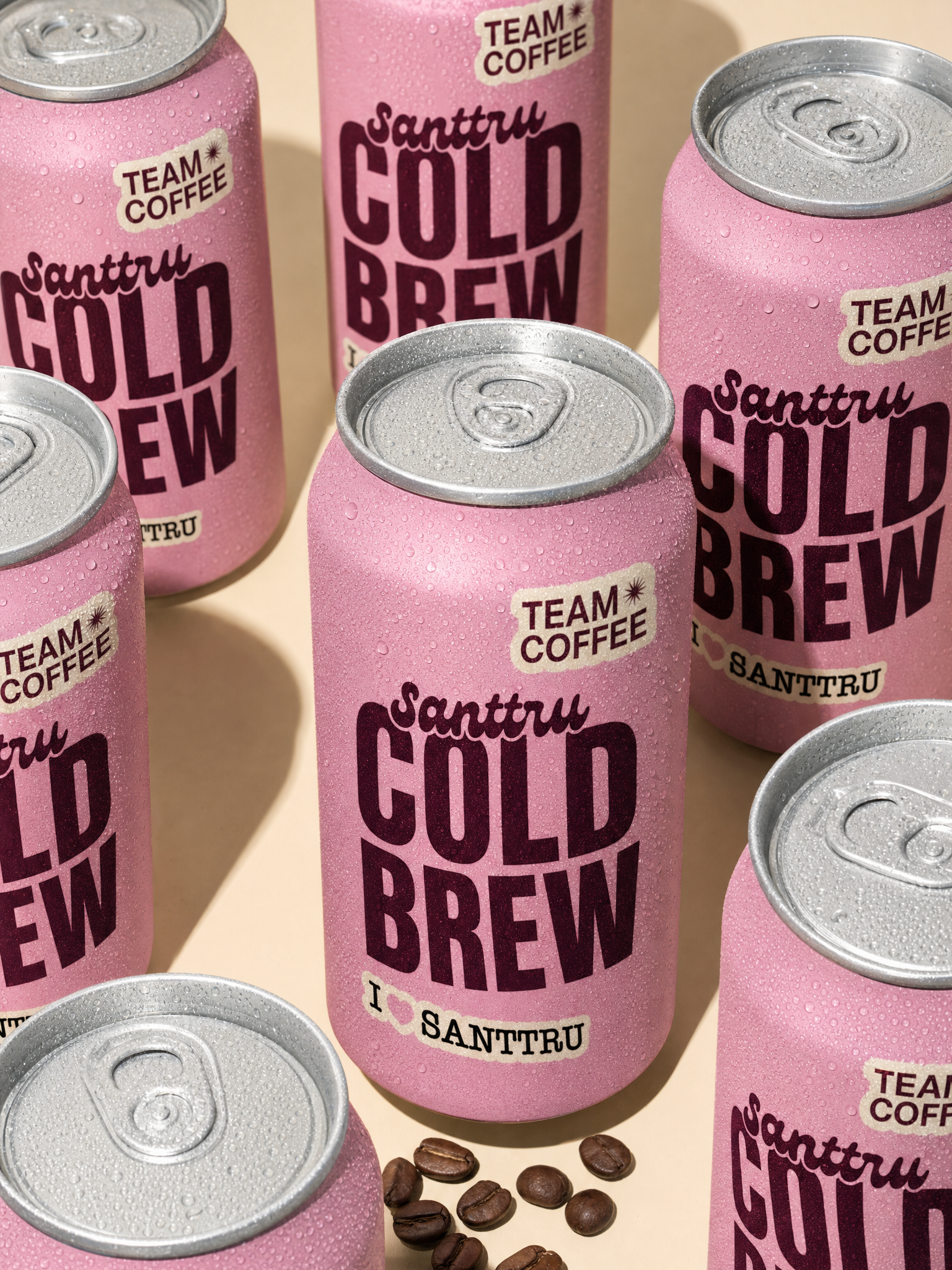
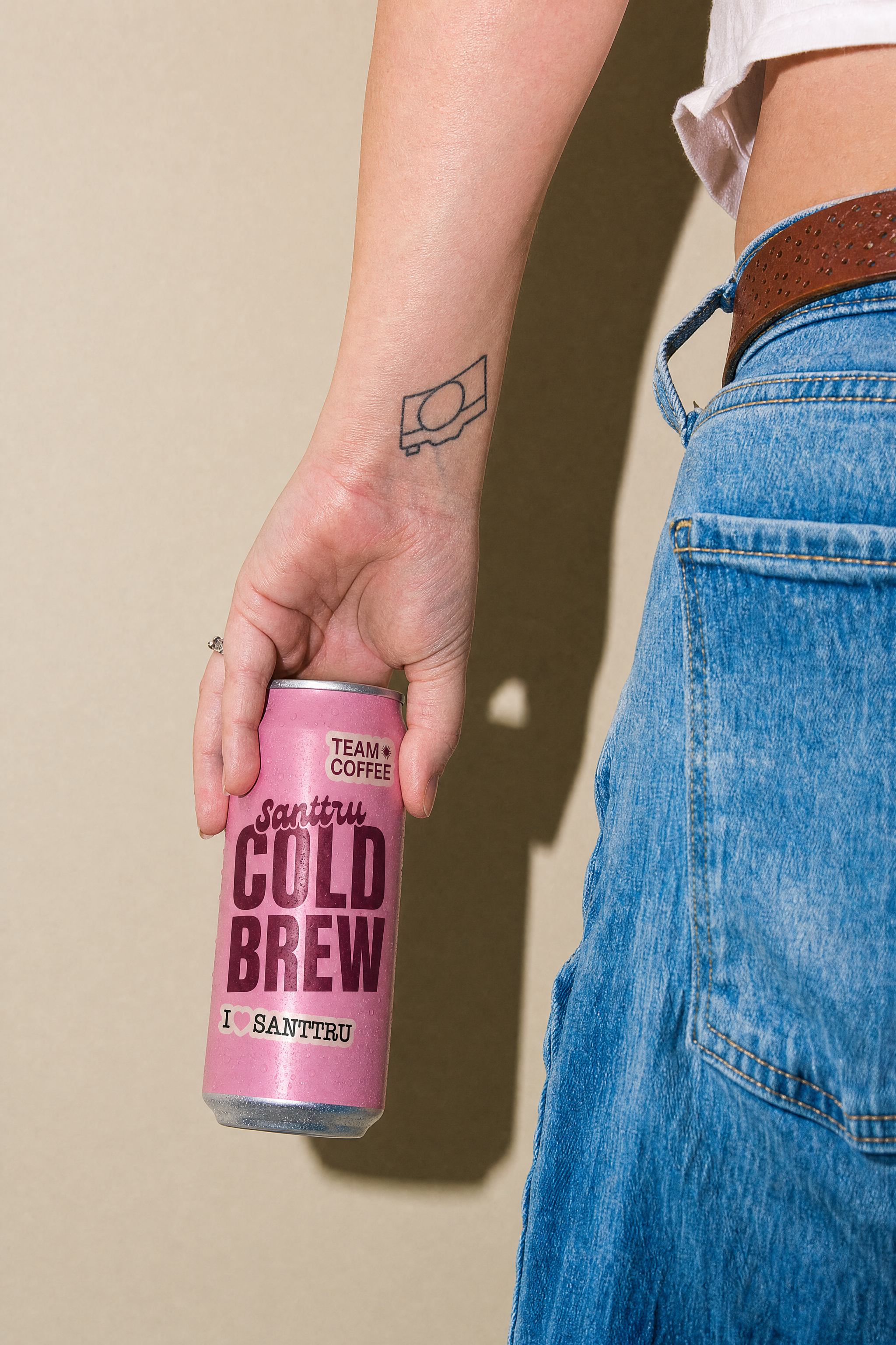
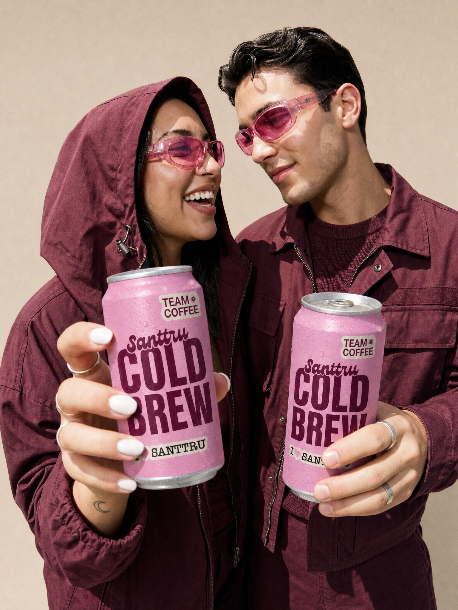
As an example of how the identity can be applied, a potential campaign was developed for the launch of Santtru Cold Brew.
The proposal explores how Santtru’s visual universe can adapt to a specific product, creating its own distinctive creative direction while maintaining a strong connection to the overall brand identity.